Monday, 23 February 2015

Thriller opening - Killbill - Claire


Kill bill –
The opening scene starts with a woman lying on the floor, covered in blood with a veil on her head. All you hear is her crying. It’s in black white. BCU shot of her from an eyelevel angle. You can’t see much setting. The lighting is bright on one side, one side of her face is shadowed. There’ a sound bridge of someone walking in towards her. This was done to create enigma and a shocking/ disturbing atmosphere. This would catch the attention of whoever is watching as it’s a very in your face opening scene. 

The next shot is of a man walking. CU of his feet. Black and white colouring, lots of shadowing, bright light from one side. Sound of the footsteps and floor board creaking. This creates suspense, because of the unknown.


 It then goes back to her lying on the floor, still in black and white with half her faced shadowed, covered in blood and with the veil on. Her breathing is heavier, you can see his feet by her head. She’s crying and he starts talking. It remains as a BCU, eyelevel shot on her for this. This creates enigma and shows the power of the man by not revealing who he is.


The man bends downs and wipes the woman’s face with a handkerchief with the name ‘Bill’ on it. You can hear him talking and her heavy breathing / crying. The colouring and lighting remains the same with black and white, and half-light and so does the shot size and angle, BCU and eyelevel. You can see he has a watch on and he is fairly old from the look of his skin. Which creates mystery and questions as to who is Bill, what does he want, did he hurt her, does she know him, ect.


This goes on for 57 seconds.


As she moves her head, and speaks for the first time she’s shot. The lighting is still dark on one side of her face, still in black and white, you can hear the sound of a gun being loaded and ready to be fired.  It’s still a BCU of her at eyelevel. As the trigger is pulled the gunshot noise is used as a graphic/ sound match and the titles come in. This is a powerful way of getting the audience’s attention because as she just announced the baby is he, he killed her, why? Why would anyone do that? It makes the viewer more intrigued.


Thriller opening - Inception - Claire


Inception – 

Starts with waves crashing about, the lighting it bright, there’s minimal colour, very pastel. It’s an eye level CU shot. The very start there’s a loud, heave drop noise like a bell/ horn of some kind.  There’s the ambient sound of the waves in the background. I think they done this to create enigma and engage the audience more.


From this shot there is a pan across the water. And the lighting dims.

It then shifts to a shot of a man with his face down into the water. You can see he has a brown jacket, brown hair, the lighting is about average midday bright, and it’s quite a faded shot. It’s an eye level CU shot of him. This was done to make the audience question who he is, why he’s there, what happened, what’s going to happen, ect.
  
It goes to a shot of a little boy, building a sandcastle, the lighting is slightly brighter than the last few, it looks quite faded still, the colouring is dull, and you can see he is at a beach because of the sand around him, it’s a MS on a slightly low angle. I think this is done to create a happier atmosphere.

it goes back to the man with his face on the shore, he’s looking down, with a miserable expression on his face, the lighting goes back to neutral, the colours are still basic, it’s a BCU shot front eye level, as he lifts his head it goes back to the little boy and a girl runs over to him, the lighting goes back to bring bright, the colours are faded, this is usually the sign of a flash back. I think they put a flash back in it to show why his facial expressions show depressed thoughts and misery.


you can see the contrast between the colour and lighting here.


It’s back to him in the water, darker lighting and more defined colours, you can see more of his body now as he stares at the children, or where the children would be. His facial expression has changed and now he looks more shocked and scared then miserable. It’s a CU shot with an eye level angle. This is done to make the viewer’s question what is going on and what he is thinking, it creates enigma.

Thriller opening - Shutters Island - Claire


Shutters Island -


The first shot is of a boat coming out from the fog. The lighting is dull and dark, the colouring is just whites and greys, there is a soft sound of the waves and boat horn, along with all other ambient sound, it's an ELS shot, this all creates enigma because you want to know who's on the boat, where the boat is going, where it is coming from, and most of all, why.


Then it cuts to a man throwing up in the toilet, the colours are basic white, greys and black. Lighting is still quite dark, you can see there is light coming from some sort of window, from what you can see he's in a suit, and you can hear him throwing up and the chains rattling at the side, it's also an ELS of him, at this point you start to question who he is and why he's throwing up, and if he's on the boat. These dark colouring create a very negative atmospheric mood. This could have been done to build up tension.


The next shot is of him looking at him self in the mirror and talking to himself, from his facial expressions, the dark colouring, lack of light and close up shot, you can see he looks ill/ nervous about something.


After this, it's a series of jumpy cuts from CU to MS, breaking the continuity. I think this is done to show his disorientation from being sea sick.


 Also between these two shots, there's a graphic/sound match.


As he turns to throw up again, the water comes on and he splashes his face with it.


With his throwing up it creates enigma, why is he throwing up? Is it just sea sickness? Is he nervous? How long has he been on the boat? Where is he going? Has he done something wrong? Ect.


In the next shot, it's a LS and he's walking through a room and picks up a jacket, this helps us to identify that this was set a good dew decades ago roughly in the 1950's due to the costume. The lighting seems to be slightly brighter in this shot as well, the colours are plain and dull, there are chains with handcuffs hanging from the ceiling. This creates enigma because people will question why there are chains and handcuffs coming from the ceiling.


Teddy walks out of the room and onto the deck, where he finds his new partner and they're just generally chit chatting. The lighting is bright, the colours seem more faded in the background, you can see the sea waves. You can see from their hats and their coats again that this was set a long time ago. It doesnt do a shot reverse shot sequence its just a facefront 2 shot of them both.


During this conversation they pull out cigarette props, while they are smoking the cigarettes there’s a cut to them face front instead of side on. I’m unsure if it’s a mistake they made or it’s supposed to be bad continuity.

Therapy scene

Script for therapy scene:

Therapist: Patient 125, state name please

Nikki: Nikki Hastings

Therapist: How are you feeling today?

Nikki: I’m ok

Therapist: So, tell me what happened?

*Cuts to flashback, children laughing, swings moving*

Therapist: Nikki, Nikki, NIKKI!

Nikki: I thought she would come back...
I have to go pick her up from school now…

*Nikki walks away*

For this scene we took inspiration from certain TV programmes such as My Mad Fat Diary:


Changes to our opening

We are changing the storyline as the original story line didn't work out with the actors.

Our new storyline:


Mother leaves Nikki when she’s a little girl in a park
Nikki creates a child in her mind and goes and sits in the park every day after picking up her imaginary child from school.
Nikki’s mother got murdered after leaving her in the park when she was younger and ever since Nikki has struggled to deal with her mother’s death, so therefore to fill the gaps in her mind she created a child and imitates her own mother.

This is the park:


Thriller openings - Girl With The Dragon Tattoo - Claire


Girl with the Dragon Tattoo –
The opening shot is of houses and trees covered in snow, it’s a fade from black start so the lighting is dark then brightens up, and the colours are dull and basic. It’s a panning shot to show you what else is around. You can see from the few houses it’s a remote place. There’s the ambient wind sound, a slow soundtrack of ‘ooohs’ then a sound bridge of a phone ringing before it cuts to the house. I think they done this to create mystery and suspense.


ELS of the house from an eye level angle 


It changed to a shot of the man picking up the phone. The lighting is only coming from on very obvious place the rest of the place is very dark and shadowed. The colours are very dull and neutral, lots of white, black and grey. It’s a MS and it’s at a slight high angle. I think they done this to make the importance of the phone call stand out.


After this shot there is a few of Shot Reverse shots, but the people are in different places, there’s a sound bridge over while the two are talking on the phone and you get random shots of them talking. Both places have dark lighting, dull and dark colouring, which sets a depressing atmosphere. Their costumes are basic, one is in a simple Woolley jumper with a zip and a t-shirt, the other have a blazer and shirt on from what you can see. The first man is at his home, while the second is at what looks like an office/study room.  The first man has MS shots, whereas the other man has CU and BCU shots. The first man is at eyelevel and the second is from high angles, and his face is never shown. I think this is done to create enigma and to make the audience more engaged, make them feel the atmosphere, the power within the scene. 


As the second man leaves the room it goes to a shot of this picture and frame on the table he was standing next to. This picture from is all that is show for the rest of the short clip. With a soundtrack, and then a fade to black. I think they done this to show what the two men were talking about on the phone and the importance of this picture.

Wednesday, 11 February 2015

sound planning Luke Harrison


https://www.youtube.com/user/NoCopyrightSounds

This is the sound planning from a YouTube video!!!

From this, as a group we can create sound that hasn't been copyright protected. By having these sounds available we can access different sounds, for example park sounds.


Royalty Free music sites


INCOMPETECH
http://incompetech.com/
ccMIXTER
http://ccmixter.org/
PacDV
http://www.pacdv.com/sounds/
PUBLIC DOMAIN 4U
http://publicdomain4u.com/
SOUNDCLOUD
https://soundcloud.com/
MOBY GRATIS
http://www.mobygratis.com/


Setting - Filming - Claire

We orginally planned to film on Brighton Pier, we emailed the head office and this was the responce -

 We decided not to film on the pier because of the money it would cost to shoot there, and we dont have a budget to cover this.

BBFC 15 certificate Luke Harrison


The British Board of Film Classification (BBFC)


http://www.bbfc.co.uk/what-classification/15
This shows what a 15 is


http://www.bbfc.co.uk/education-resources/student-guide
This is the timeline for the classification

https://www.commonsensemedia.org/movie-reviews/the-departed
https://www.commonsensemedia.org/movie-reviews/the-professional
These two films are both thrillers and both 15 rating.


Results of the Questionnaire Luke Harrison


Mackenzie Court


1) Out of 10 is this a good story?
Answer: 9/10


2) Would you watch this out of choice
Answer: Yes


3) For our project we don't show the ending however, how would you like to see it end?
Answer: The family to be back together!


4) Do you have any other questions?
Answer: Is the mother in danger?


Tommy S


1) Out of 10 is this a good story?
Answer: 7/10


2) Would you watch this out of choice?
Answer: Yes


3) For our project we don't show the ending however, how would you like to see it end?
Answer: I want to the child to find out the reason why she left and is she in trouble?
4) Do you have any other questions?
Answer: No

Story Board Adjustment - Claire

We need to change our story board in order to be able to pull off the "10 years later" effect, instead of seeing the mother and son at the beach toegther, we're now not really showing the mother and just showing the son. 

This is because of Costume, Hair and Makeup difficulties due to a £0 budget, we could not offord the required costume elements.  

Results of the Questionnaire Luke Harrison

Oscar Martin

1) Out of 10 is this a good story line?
Answer: 6/10
2) Would you watch this out of choice?
Answer: no not my sort of film, I prefer a comedy or horror
3) For our project we don't show the ending however, how would you like to see it end?
Answer: I would like the mother to say "sorry" and they all make up!
4) Do you have any other questions? 
Answer: No


George Stone
1) Out of 10 is this a good story line?
Answer: 7/10
2) Would you watch this out of choice?
Answer: yes and no? I like the mystery about it however I like comedy's more!  
3) For our project we don't show the ending however, how would you like to see it end?
The child to find his/hers parents and the reason why behind all the mystery.
4) Do you have any other questions? 
Answer: No


Setting Luke Harrison


The setting will be at Dolphin Center park As a group we have decided to do this because it close to our homes and it fits in to the plot of the parent thinking she has a child. Firstly we decided to use a forest however the lighting would always be an issue. By using the park equipment in the park matches the time line. We also made contact with Brighton pier workers and Claire has got a email to back this up. However we are not going to film on the pier because the cost is too much! As a group we decided the best place is the park.


This was a advantage for our group because it was a five minute walk from the Haywards Heath collage and we can go back and forward and not wast anytime.


target audience Questionnaire Luke Harrison


Me and the group have decided to choose our target audience as 15 and above. I having been researching about the age rating and i feel that this is the most suitable one to have.


Our film is about a child and a mother. the mother leaves the child however as a audience we don't know why? However the child grows up to look for his/her parent that left them all these years ago!


1) out of 10 is this a good story line?#


2) would you watch this out of choice?


3) For our project we don't show the ending
however, how would you like to see it end?


4) Do you have any other questions?


Monday, 9 February 2015

The prop camera- Kayla and Claire

This is the prop camera we were going to use before we changed our storybaord.
This camera was suppose to be what the mother used to film her child at the beach when we were filming her, as we were going to have it set back 10 years ago camera would have been older, and the quality would have been bad too so we were going to put an effect on our normal camera when we filmed the child from her hands, as it being the prop camera.


photo and bad bad video luke harrison


this is a example of a piece of footage that i shot and these are the effects that i used.

this is another example by using the video to show the effects. we are looking to do this in our final piece.

How to create 10/15 years ago- Group idea

Setting:  Beach/ underneath pier  - 10/15 years ago

Mother is recording with an old camera (prop)
Switches to actual camera POV shot: deliberately bad footage e.g. handheld, amateur to suggest it was filmed about 10 years ago.
Mother puts down camera and forgets it's still filming, just the pebbles are shown.
Awkward cut and boy is left alone. We don't see the mother leave, we hear dialogue. 


What we need:
A 10 year old boy
A women
An old towel
An old camera (prop)
A 10/15 year old coat
Old  swimming shorts

Story Board - Claire

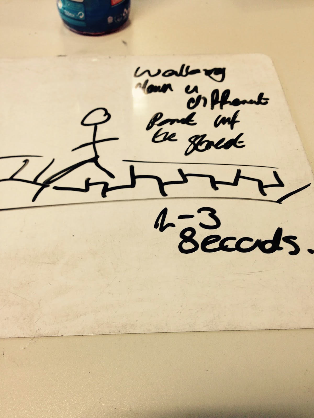
This is part 2 of our Story Board -


Story Board - Claire

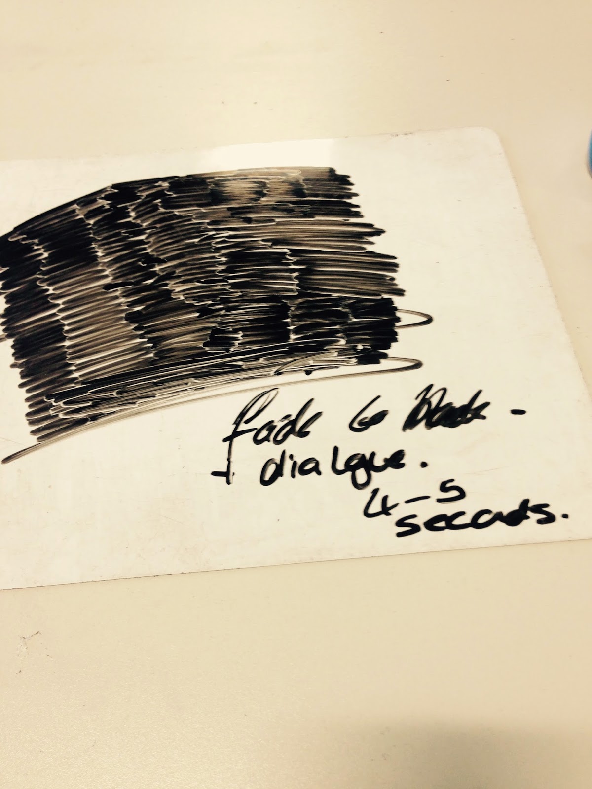
This is part 1 of our Story Board -